Idylwyld Project | Guest Bedroom Reveal
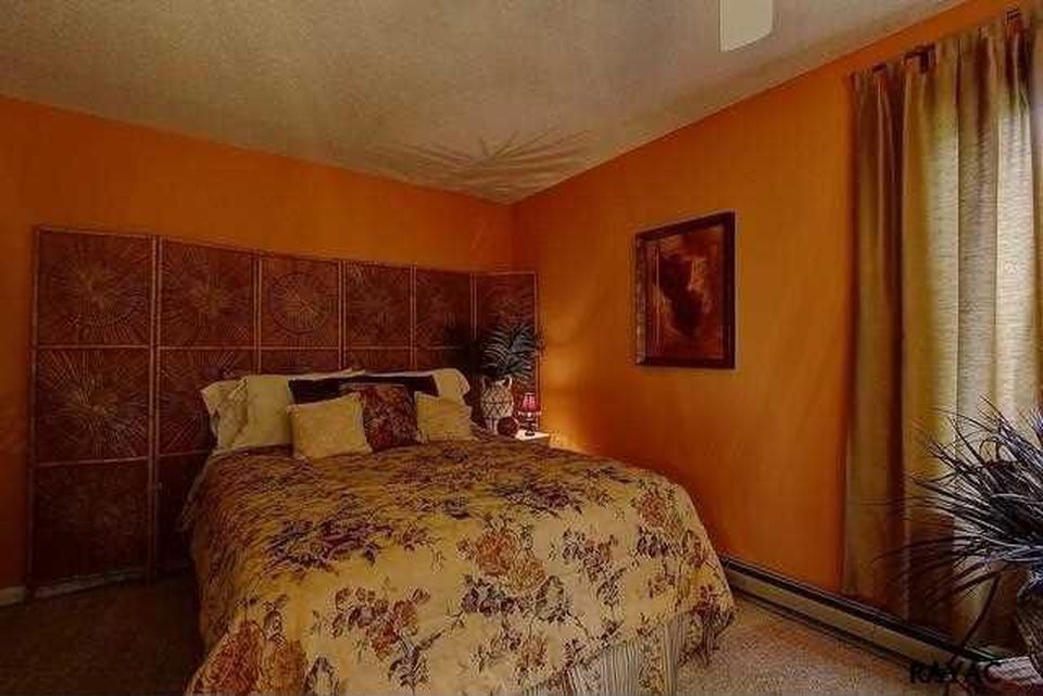
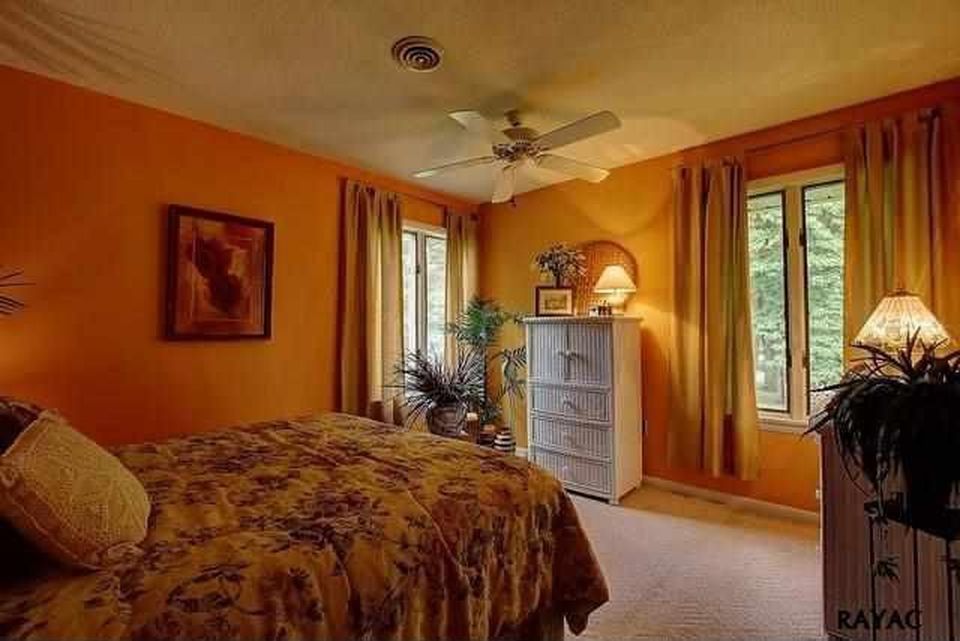
It's REVEAL DAY! If you missed yesterday's introduction to the Idylwyld Project, you can read it here. To quickly recap, I recently designed a guest bedroom for a local couple, Doug & Jessica, who wanted to create a stylish, comfortable, put-together space to host their friends and family from out of town. My clients love traditional, antique and industrial design styles but this room had to make sense with the modern style of their 1970's ranch home. Also this room is fairly small (those before photos are from the real estate listing and make the room look a lot bigger than it really is!) and being on the northwest corner of the house, it doesn't get a ton of natural light.
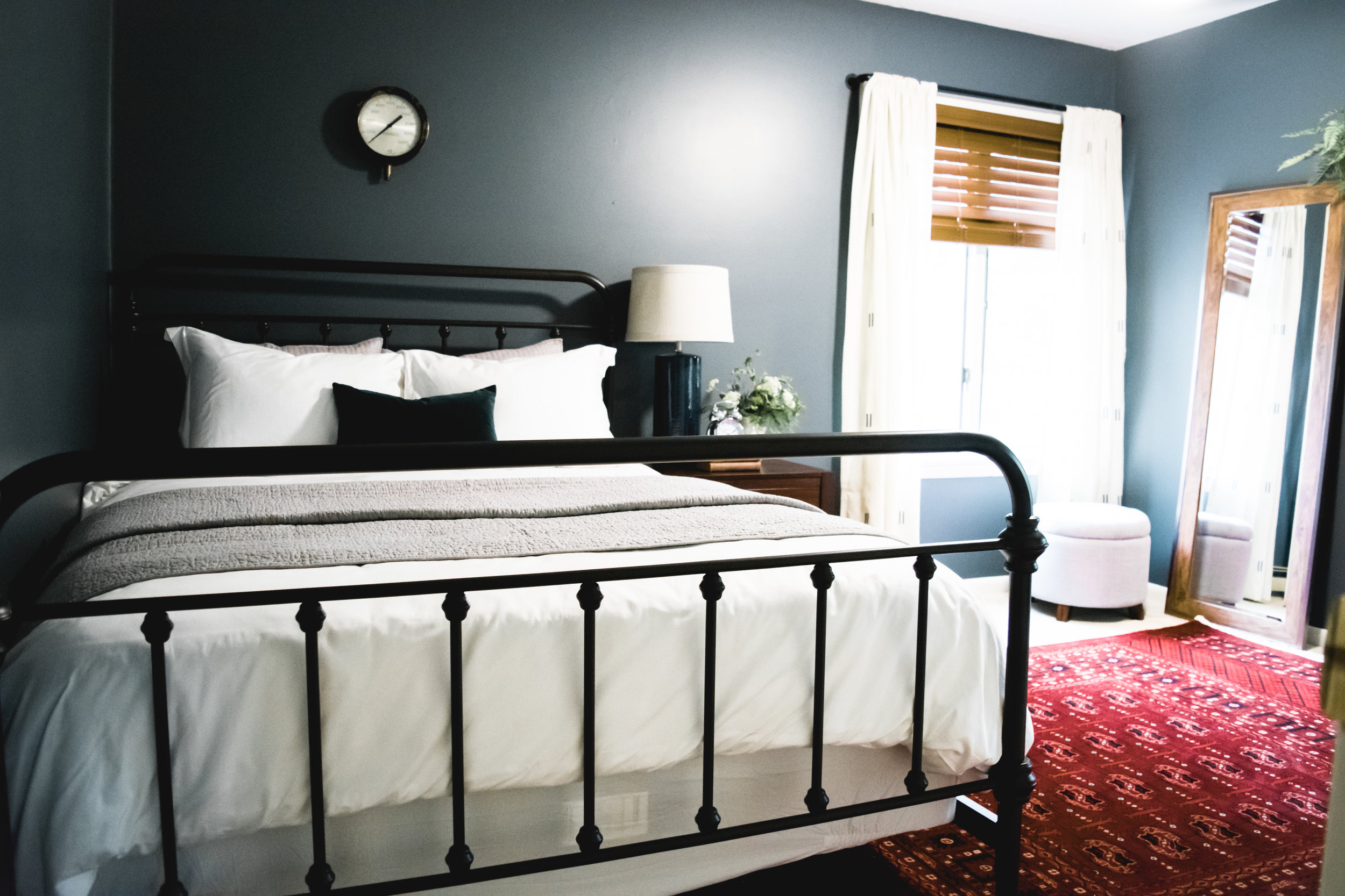
Now it may seem counterintuitive to paint a small room with little natural light a darker color, but that's exactly what we did. Why? Sometimes I think it's better to work with the nature of the room instead of against it. We could have painted the walls white but I've found that in rooms without a lot of natural light white tends to fall a little flat. A guest bedroom is a perfect place for a statement wall color. It adds so much interest to the room and creates a cozy, inviting, and restful feel. We chose Grays Harbor by Sherwin Williams. We also replaced the existing carpeting with pet-friendly Stainmaster Casey in Coastal. The carpeting has a gorgeous, low-pile design with a subtle herringbone pattern. The new paint and wall-to-wall carpet alone made a dramatic difference in the space, but scroll down for the full reveal!
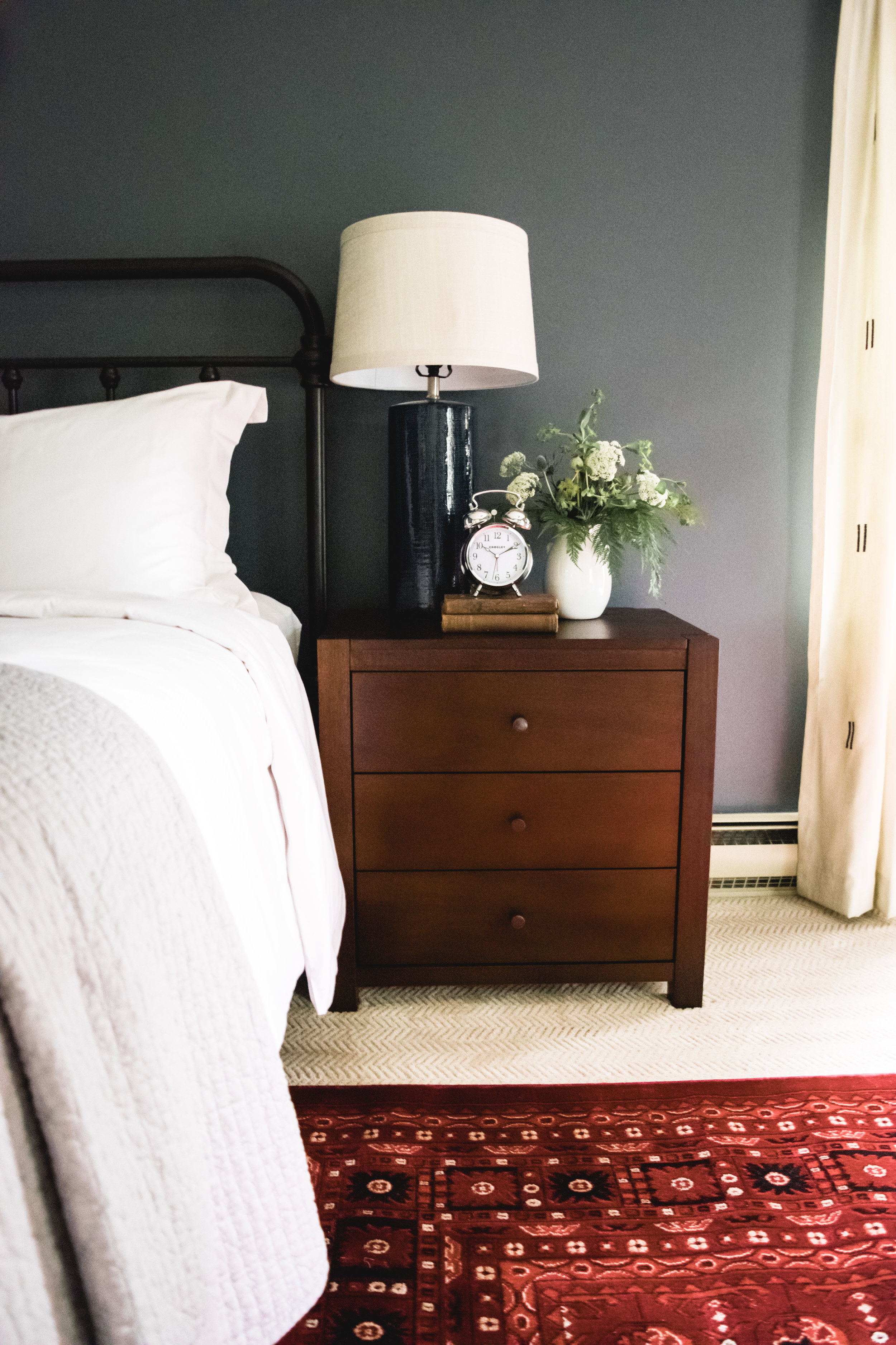
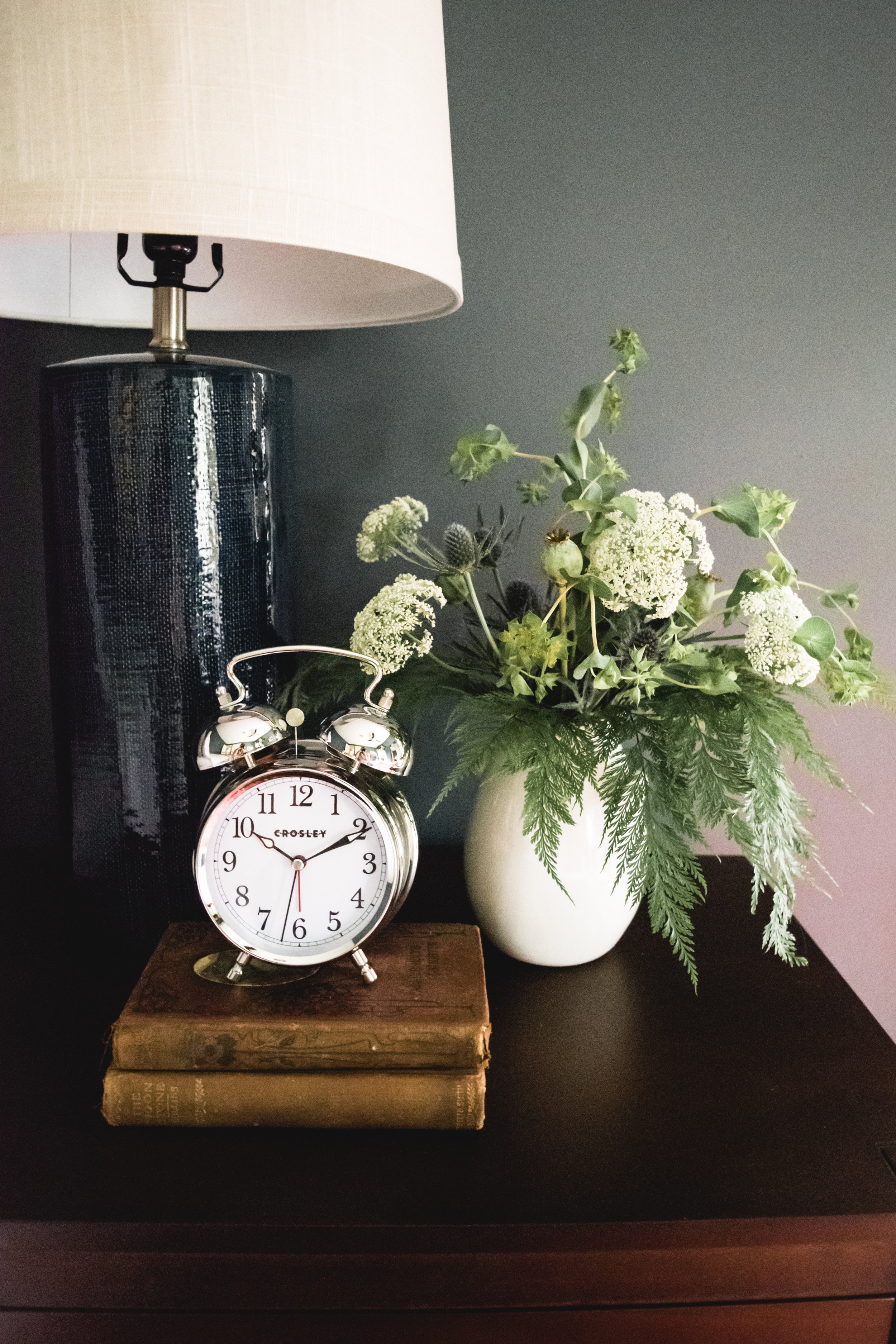
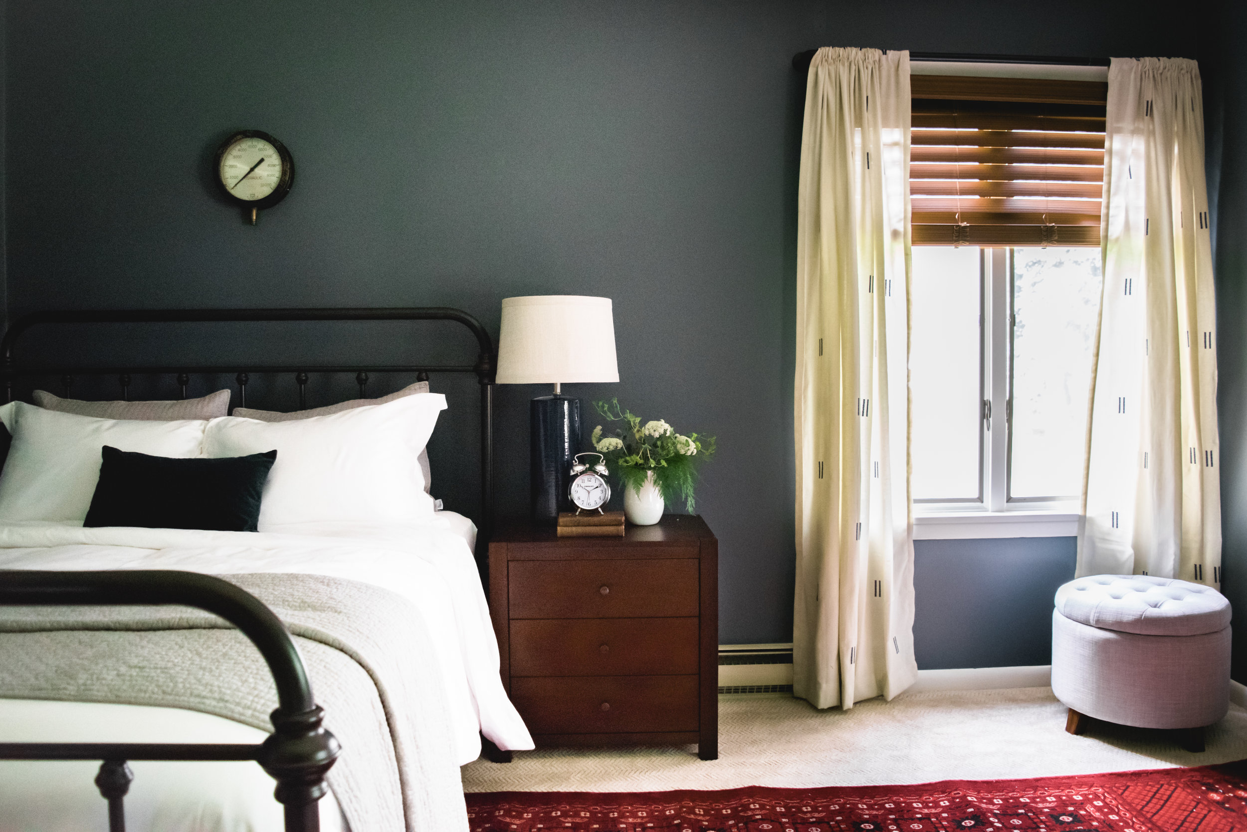
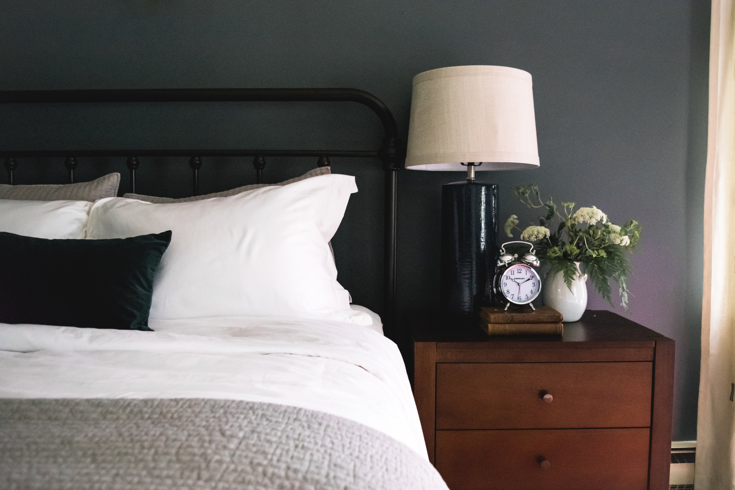
This might be my favorite nightstand styling ever. I love how the contemporary lamp mixes with the antique books and vintage style alarm clock! The stunning floral arrangement was created by Foster's Flower Shop. The clean lines of the nightstand contrast the antique-style metal bed while the walnut stain, along with the matching wood blinds adds so much warmth to the room!
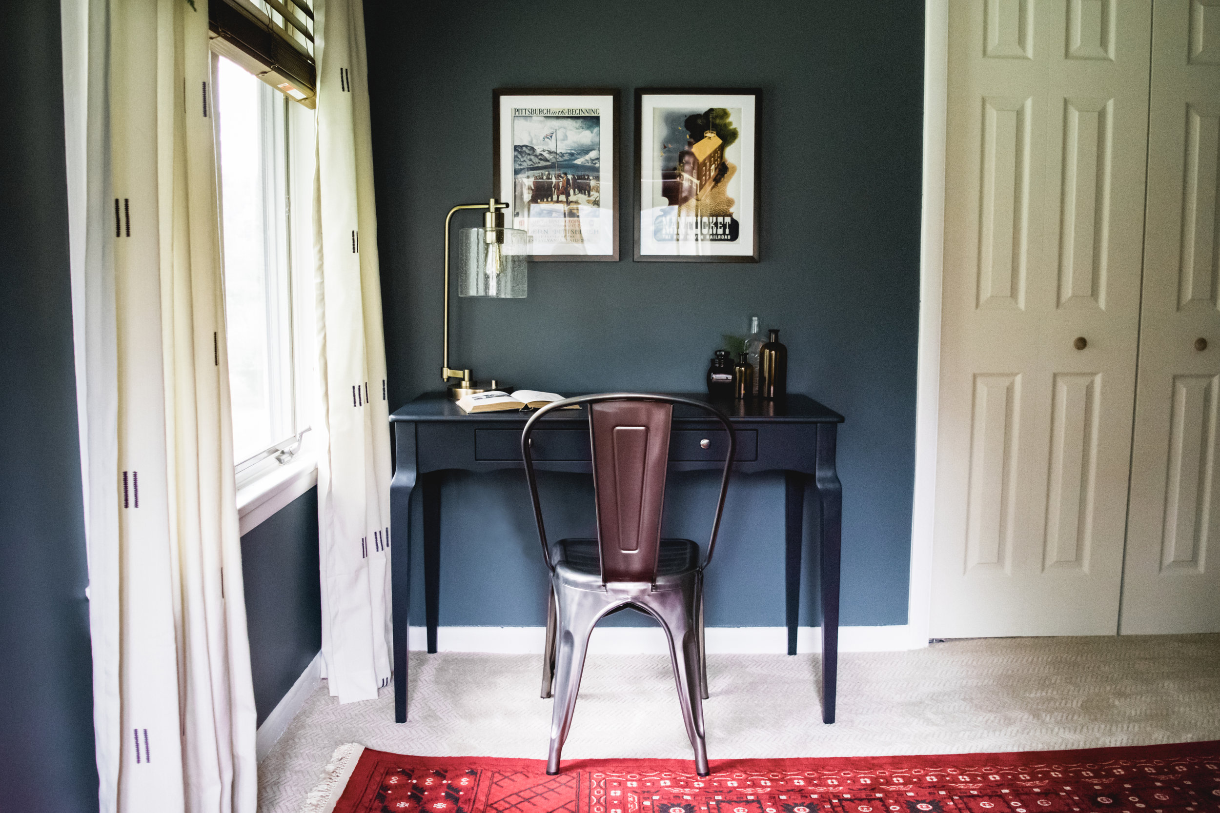
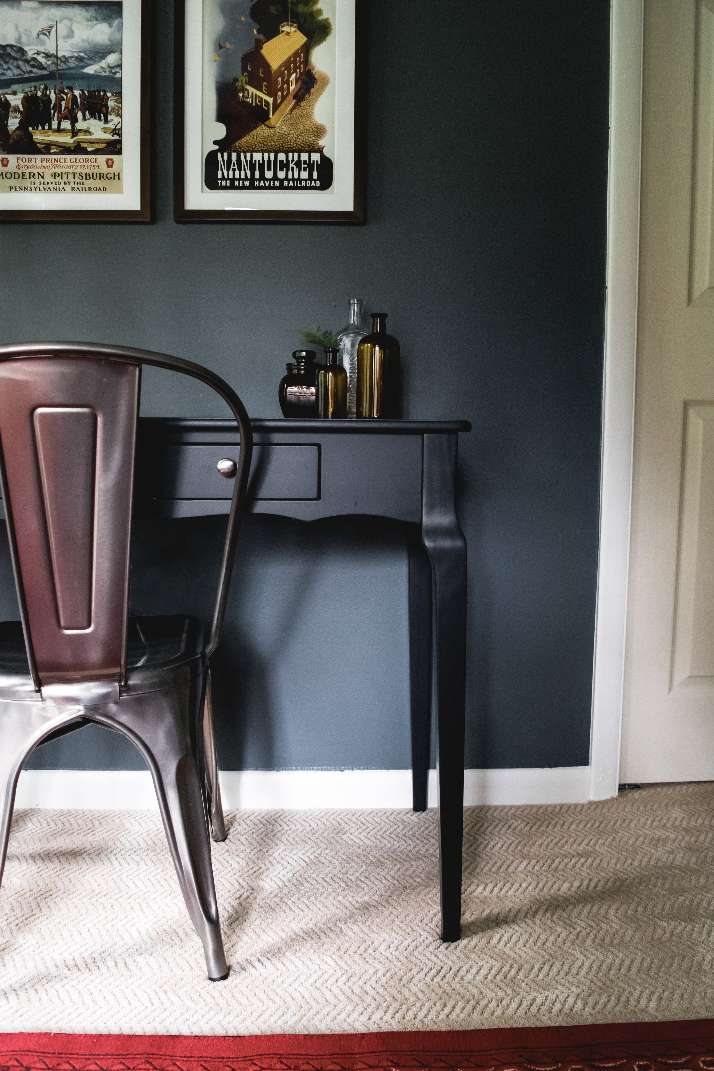
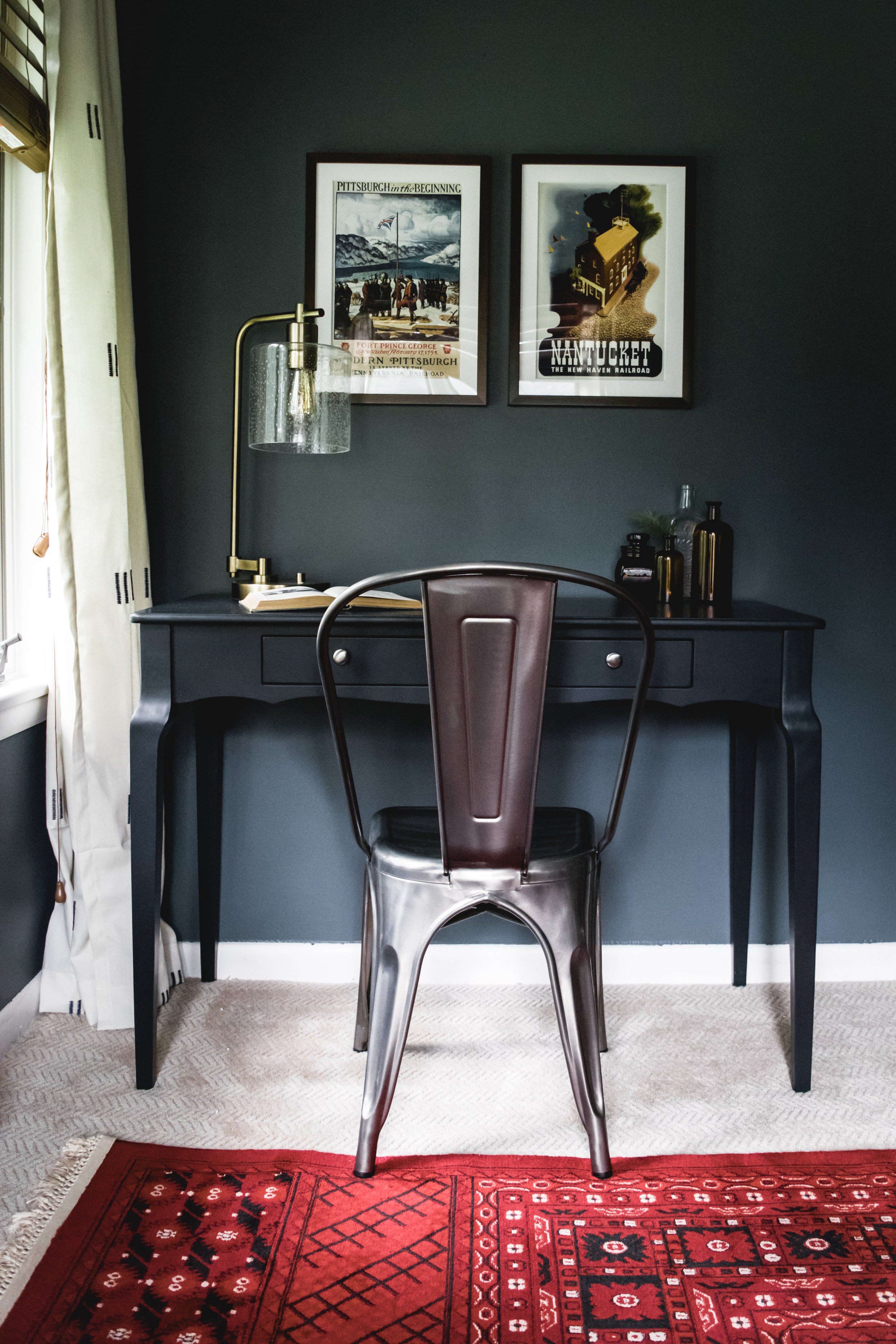
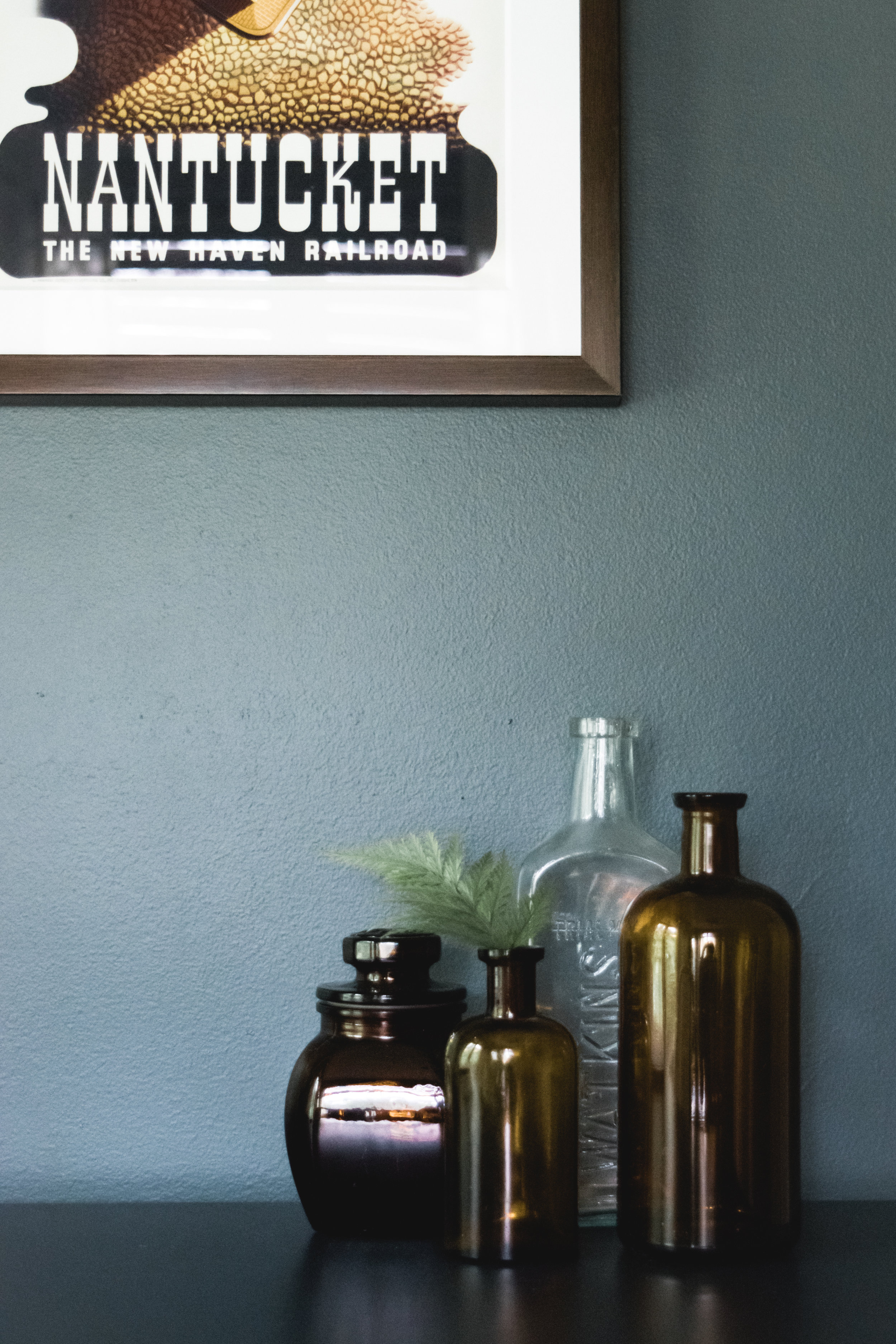
For the desk styling, I was inspired by Doug's love of all things steampunk. I sourced antique reproduction prints of railroad posters from places that were meaningful to the homeowners. Pittsburgh is where Doug went to college and Jessica is from New England. I kept the rest of the desk pretty simple with a few amber apothecary bottles and an antique book on chemistry as a nod to Doug's career as a pharmacist.
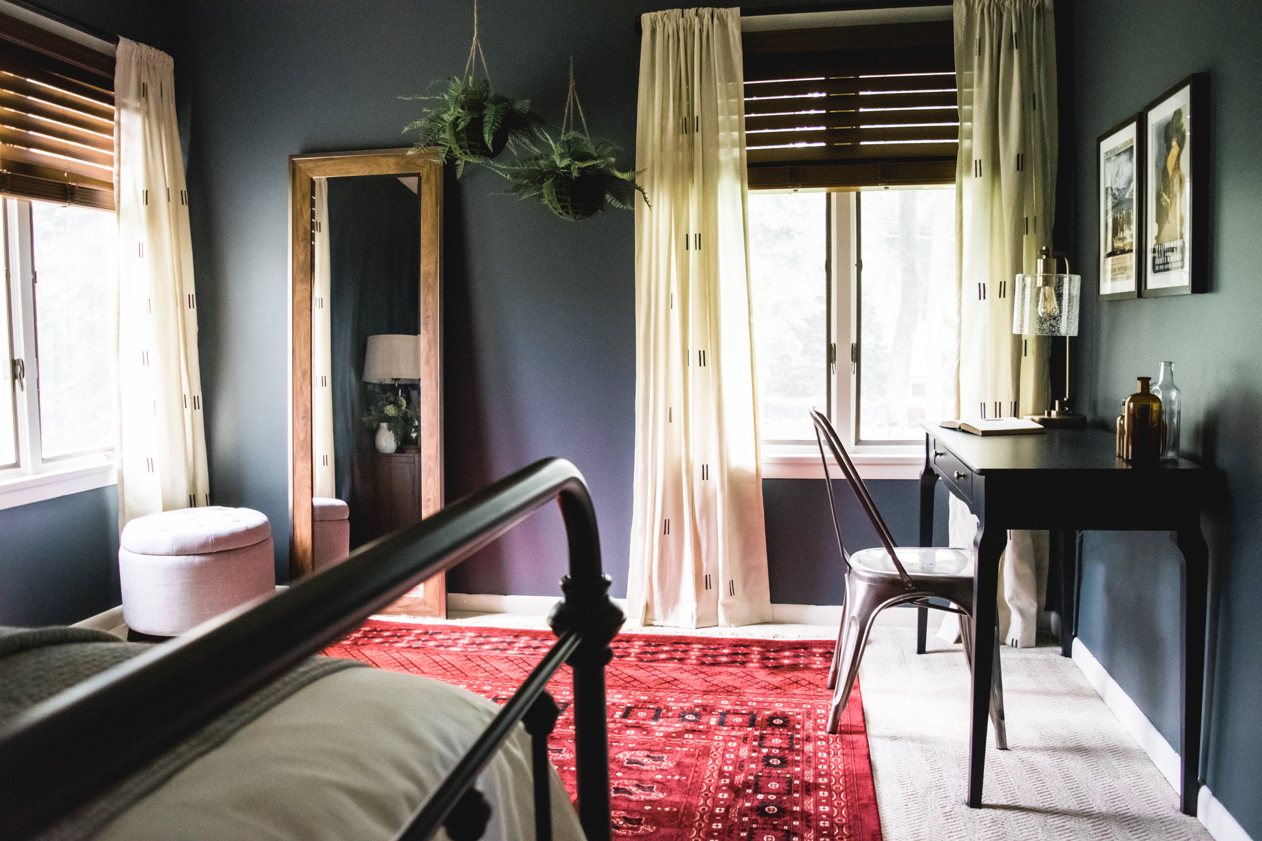
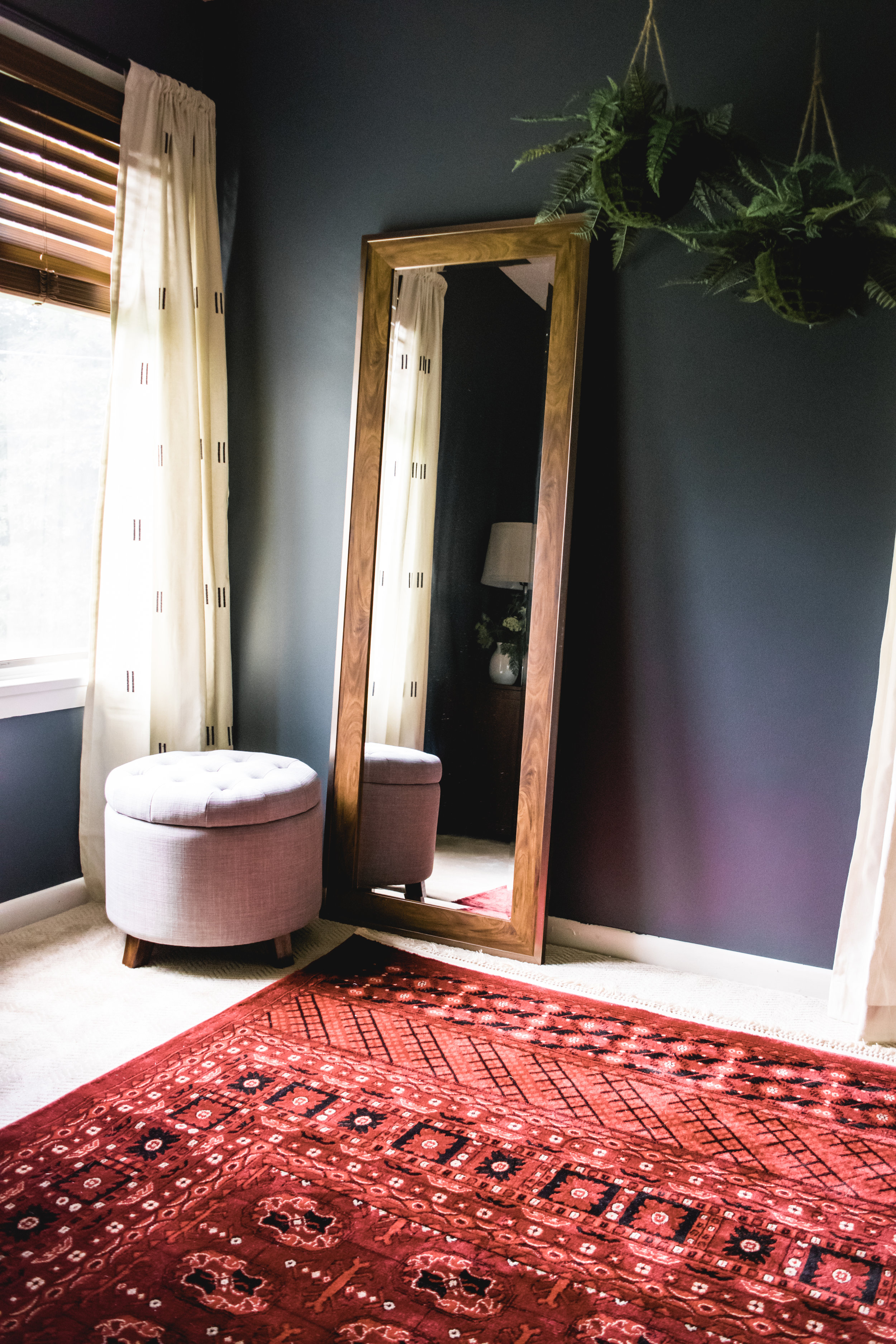
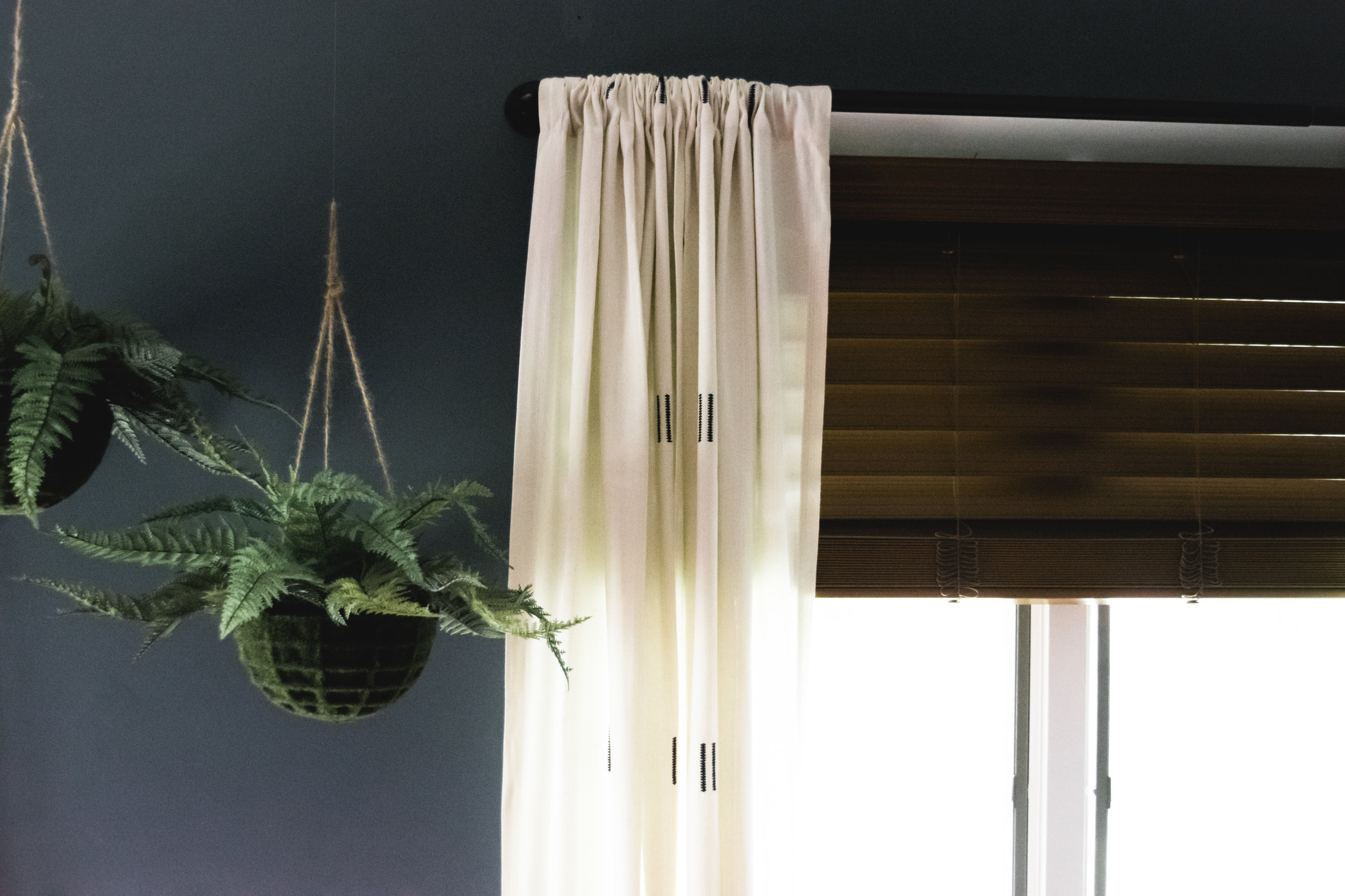
If this was a bedroom that would get daily use, I would have placed a tall dresser in this corner. But since it's a guest bedroom, I took the opportunity to do something a little different. A tall leaning floor mirror reflects more light into the room and makes the space look bigger. The gray linen upholstered ottoman next to it has hidden storage and is a great spot for guests to set their bags. To finish this corner, we hung two potted faux ferns from the ceiling because every room needs a little greenery! Hanging them from the ceiling added a unique effect while also keeping them out of reach from the homeowners' pets.
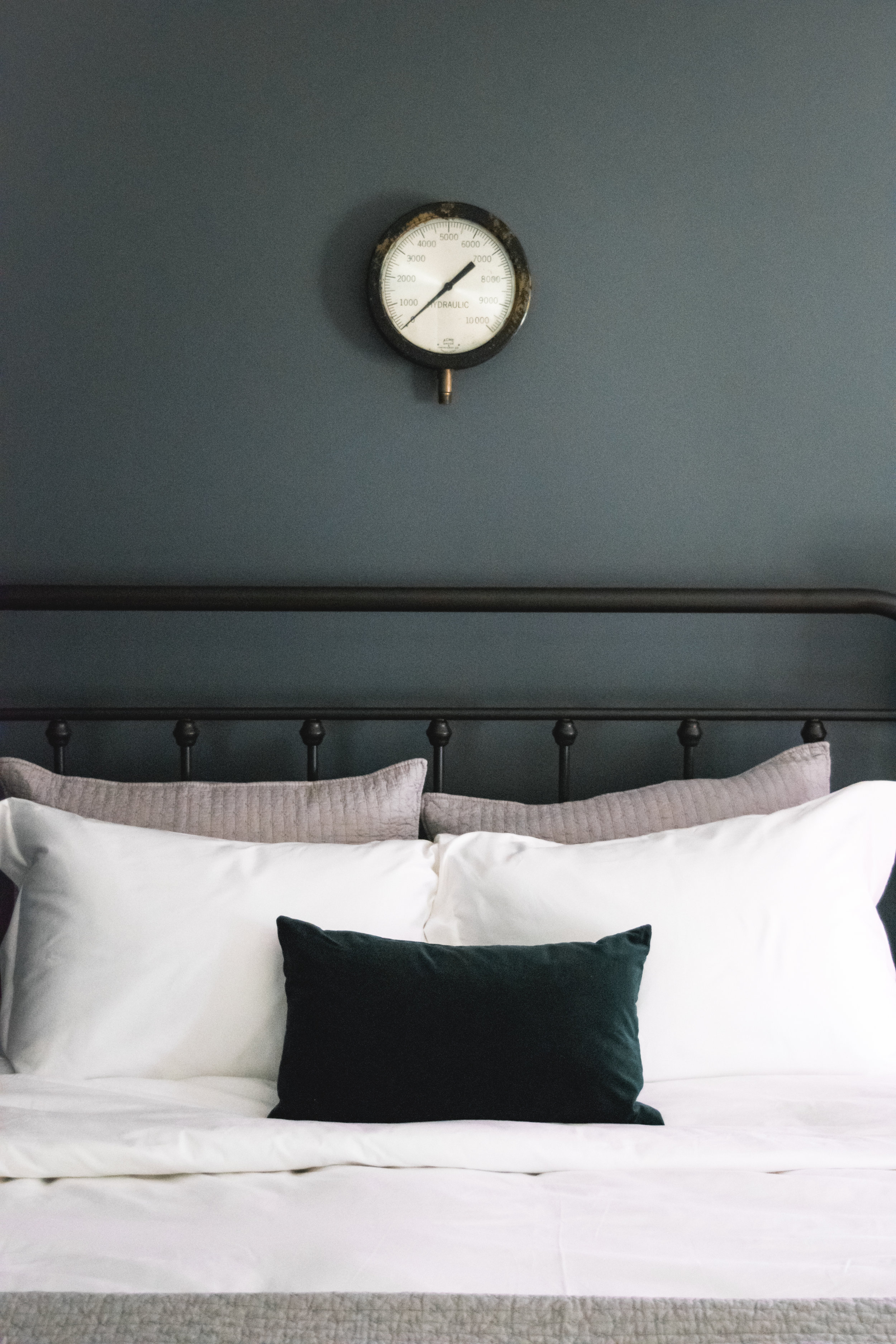
Possibly my very favorite detail of this space is the antique pressure gauge that we hung above the bed. I found it at a salvage shop almost a year ago and immediately texted a photo to my clients. It's over 8 inches in diameter and I love how at first glance, you would assume it's a clock. It's little details like this that really make a room for me. I love design that doesn't take itself too seriously!
Stevie Storck Design Co. is a boutique residential interior design firm that specializes in elegant, eclectic style on mid-range budgets. We are based in York County, PA and serve local clients with consultation and full-service interior design and offer E-Design services for clients nationwide. To request more information about booking your next home design project with us, click here.










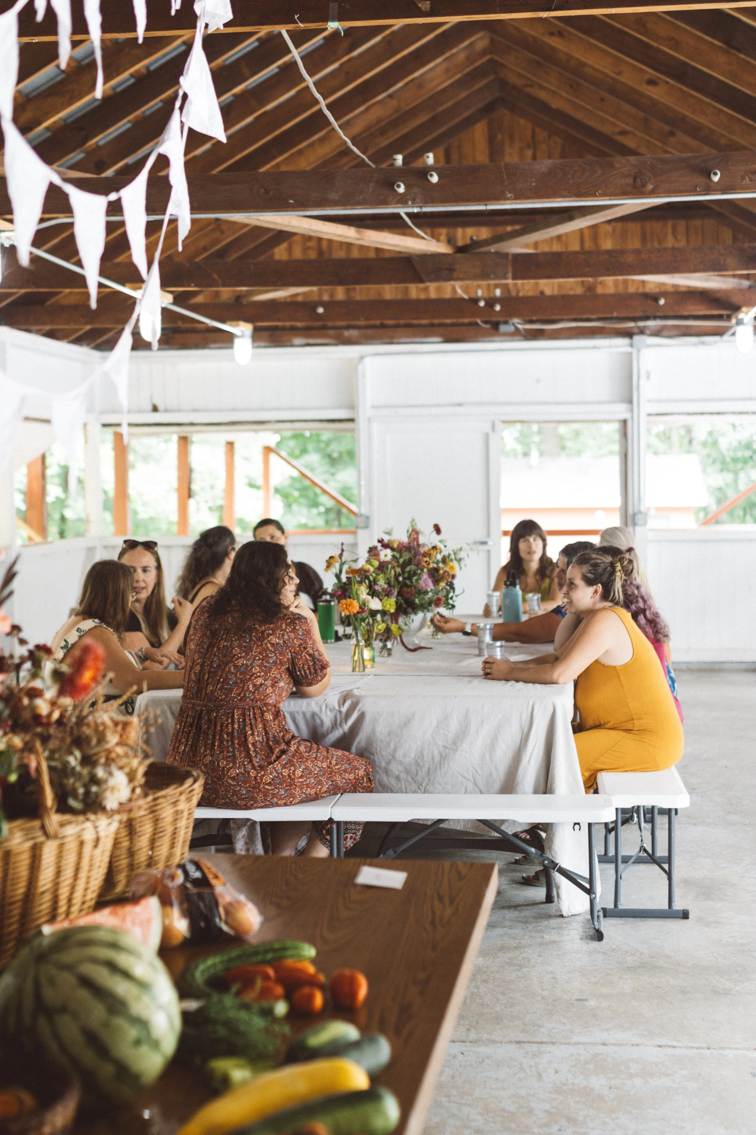
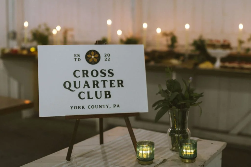


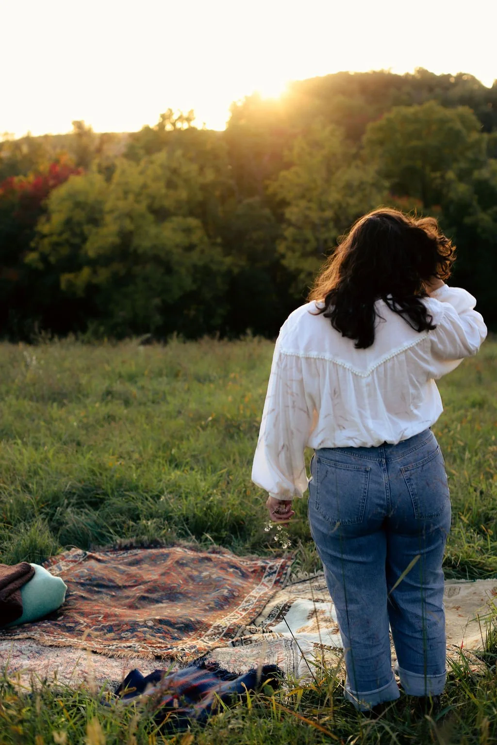
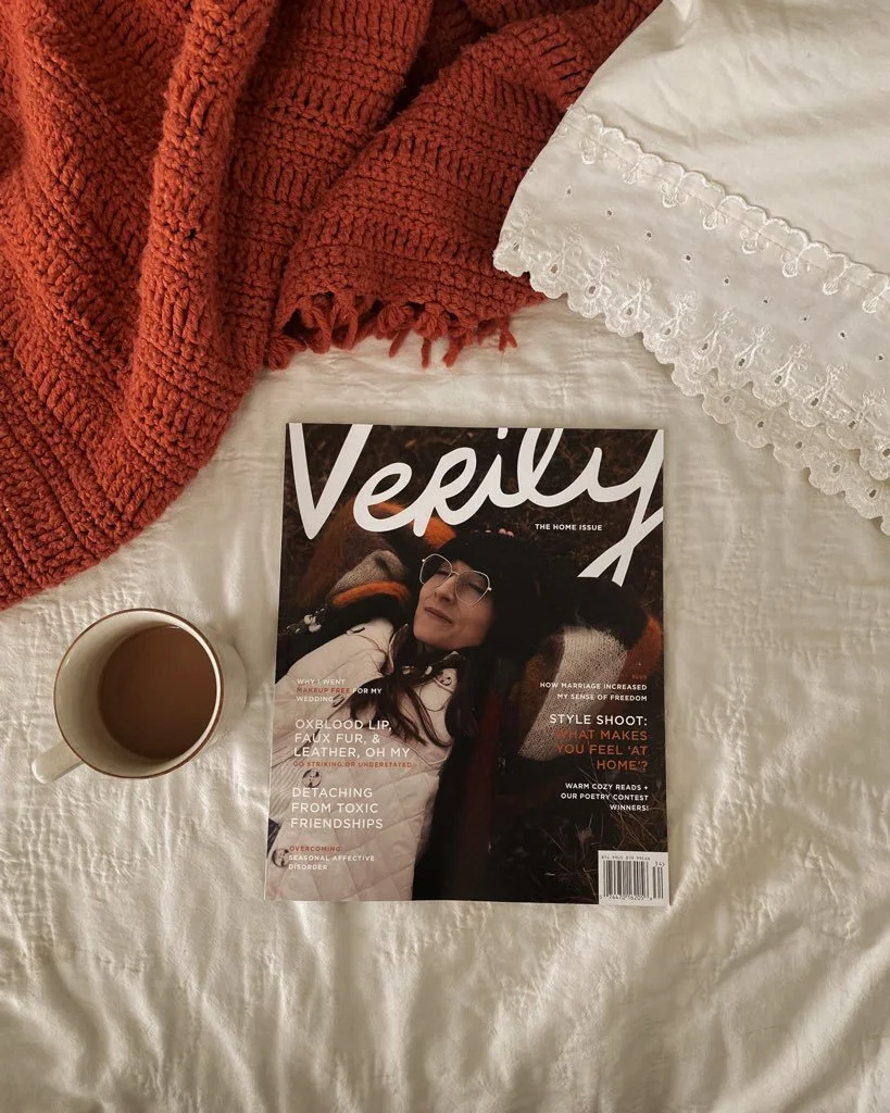

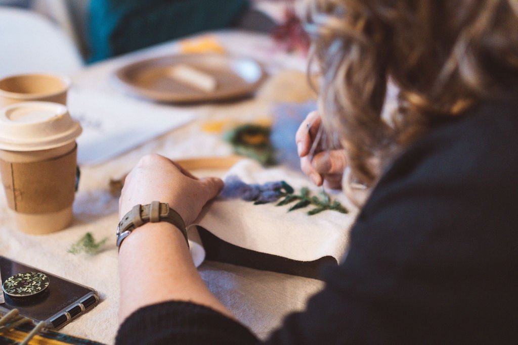

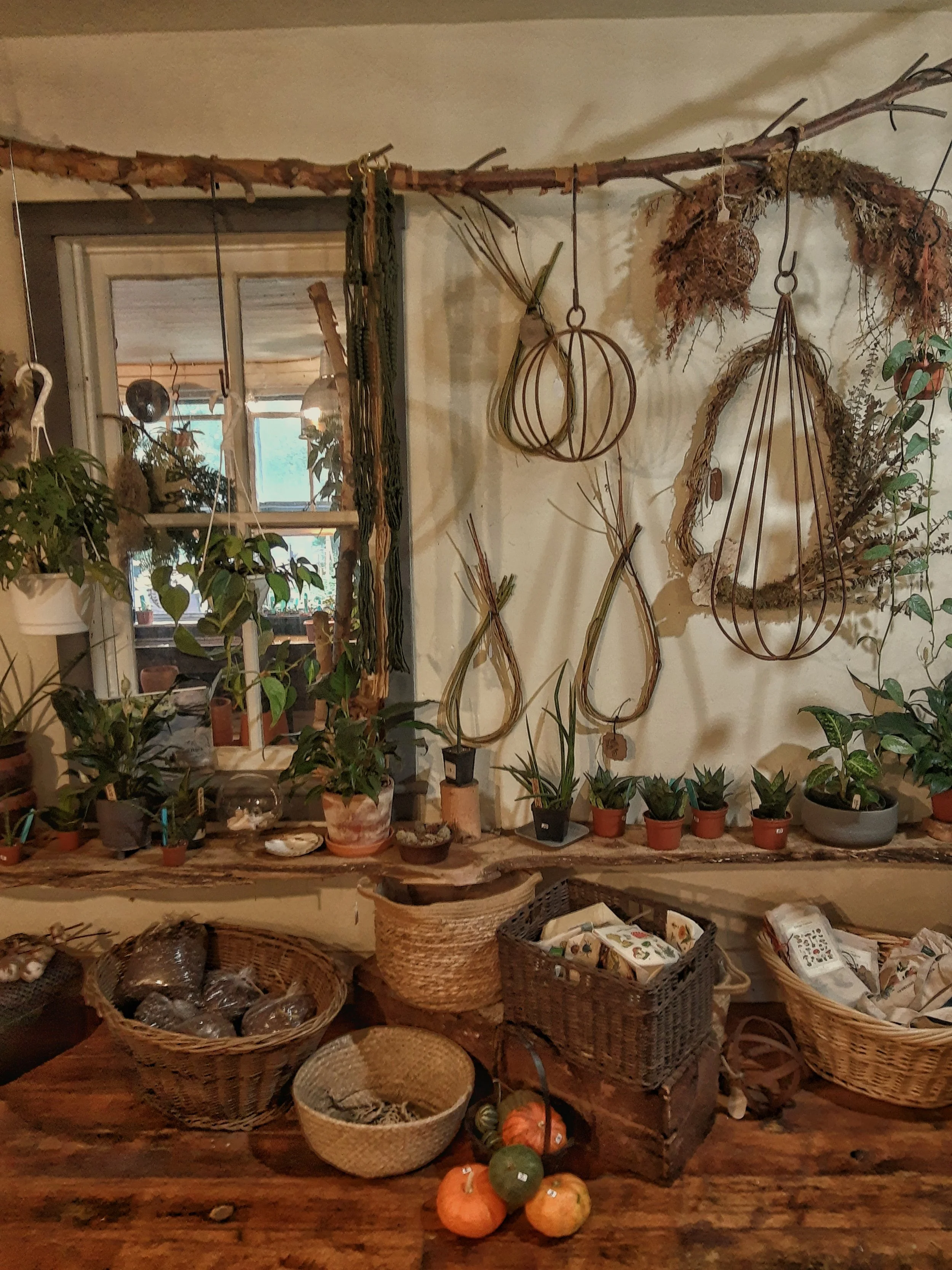
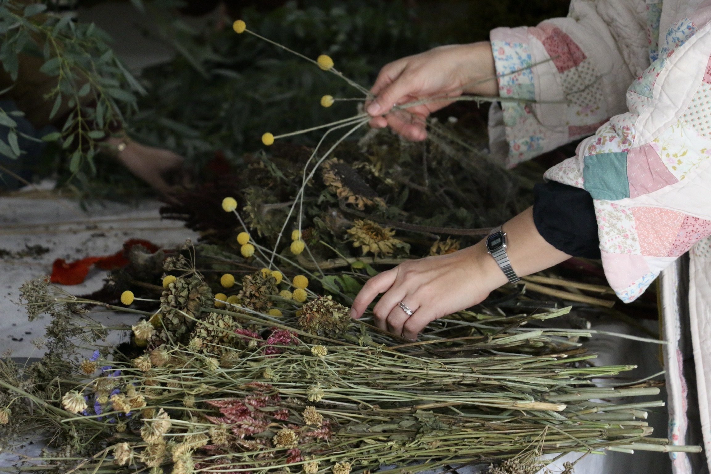

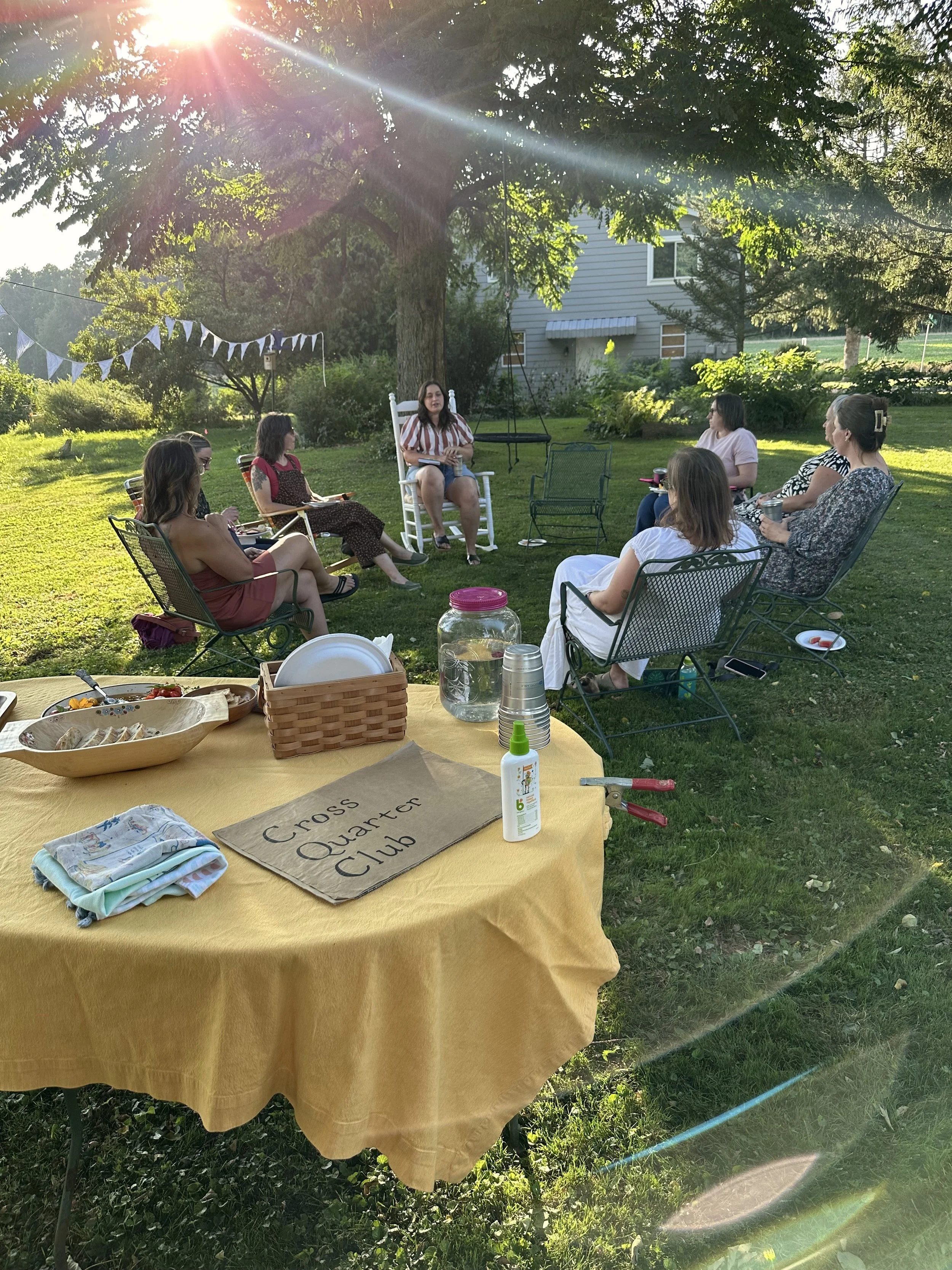

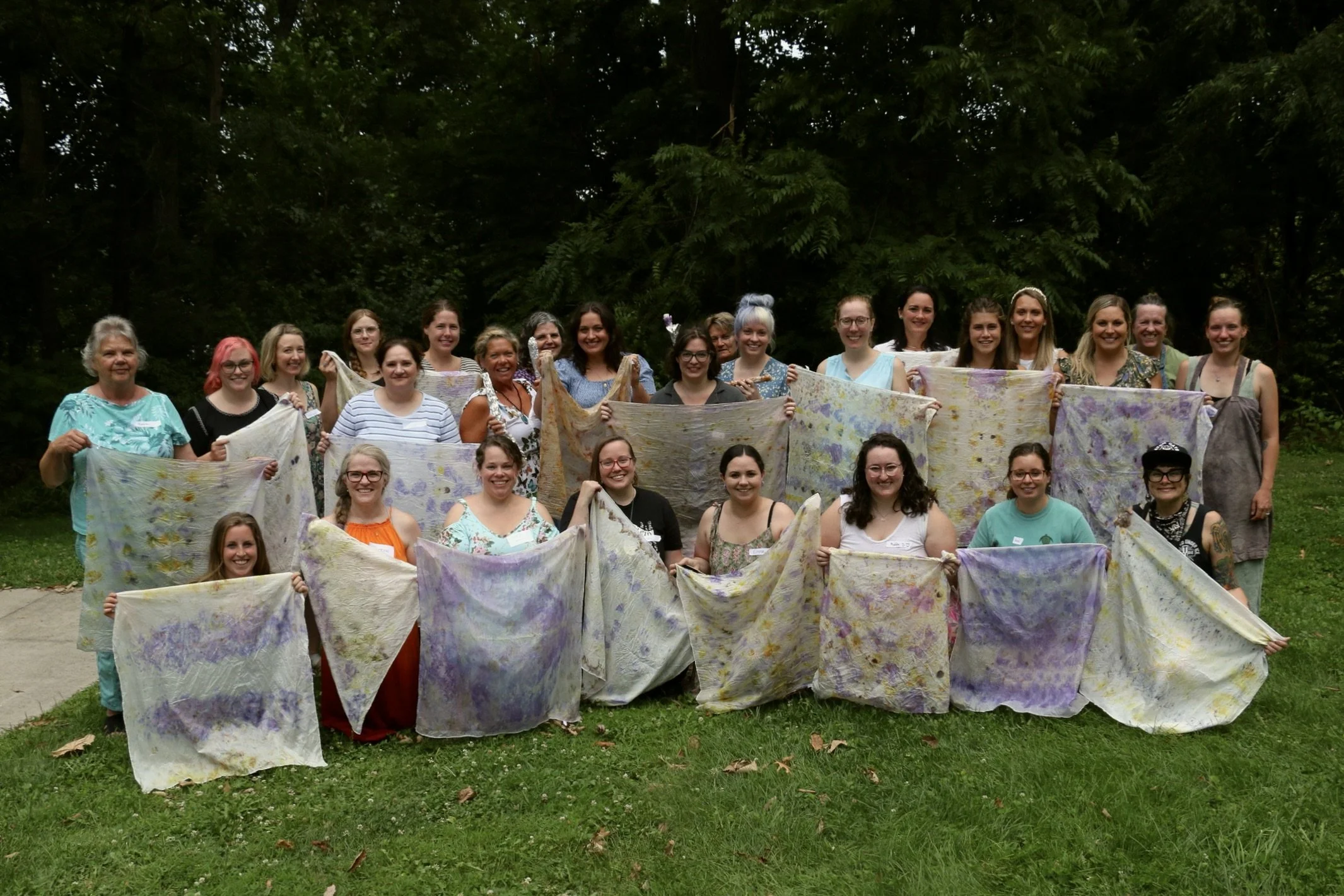


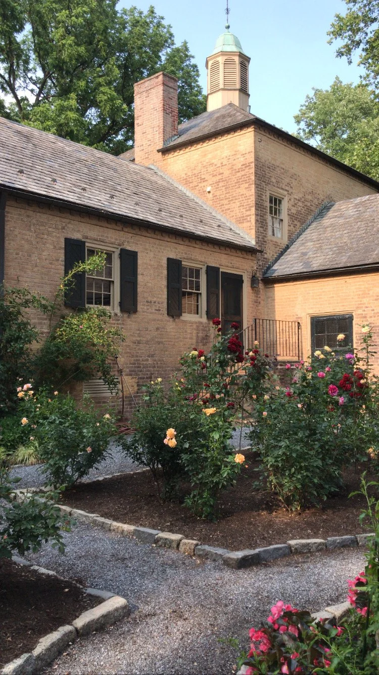
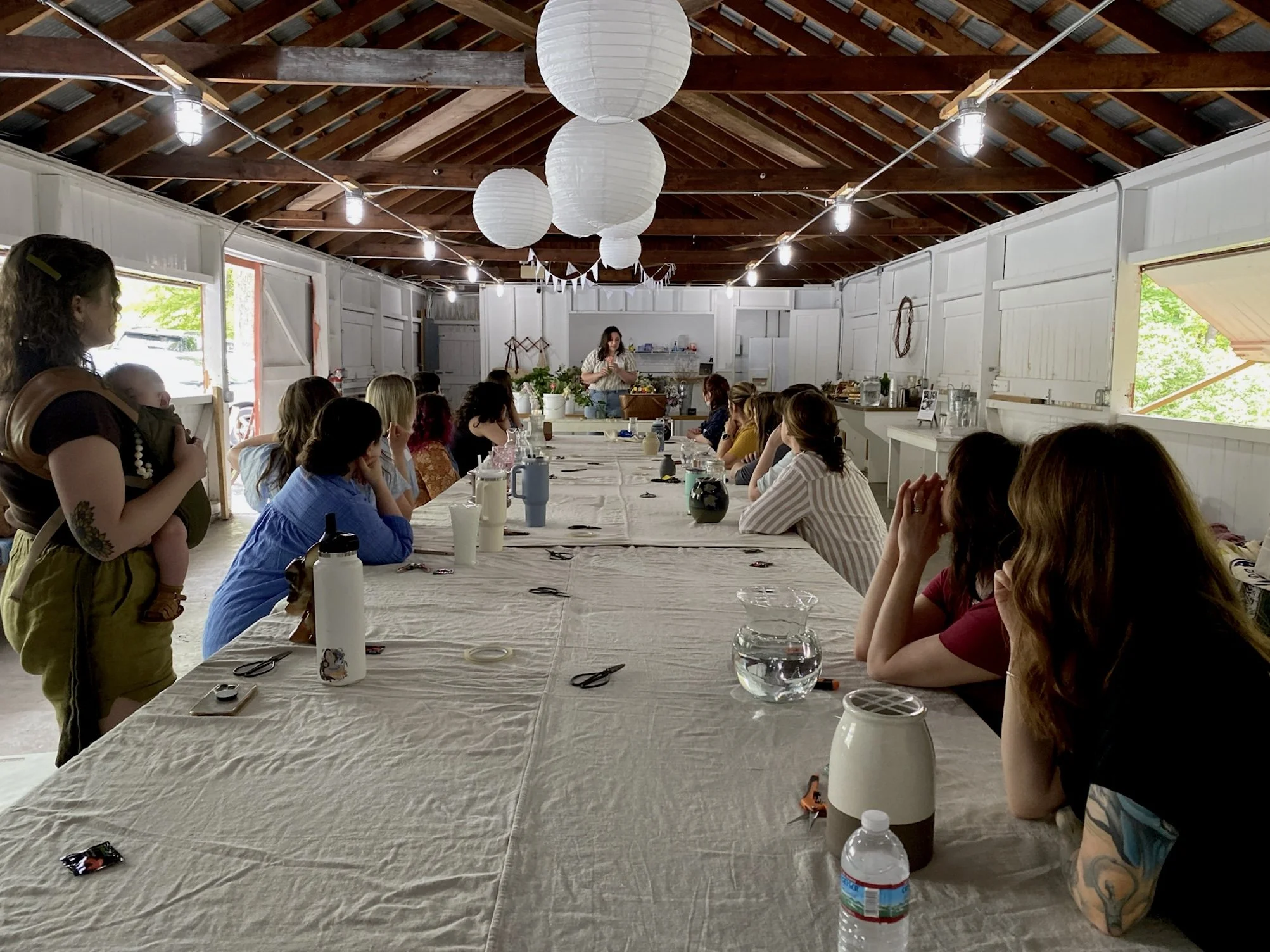


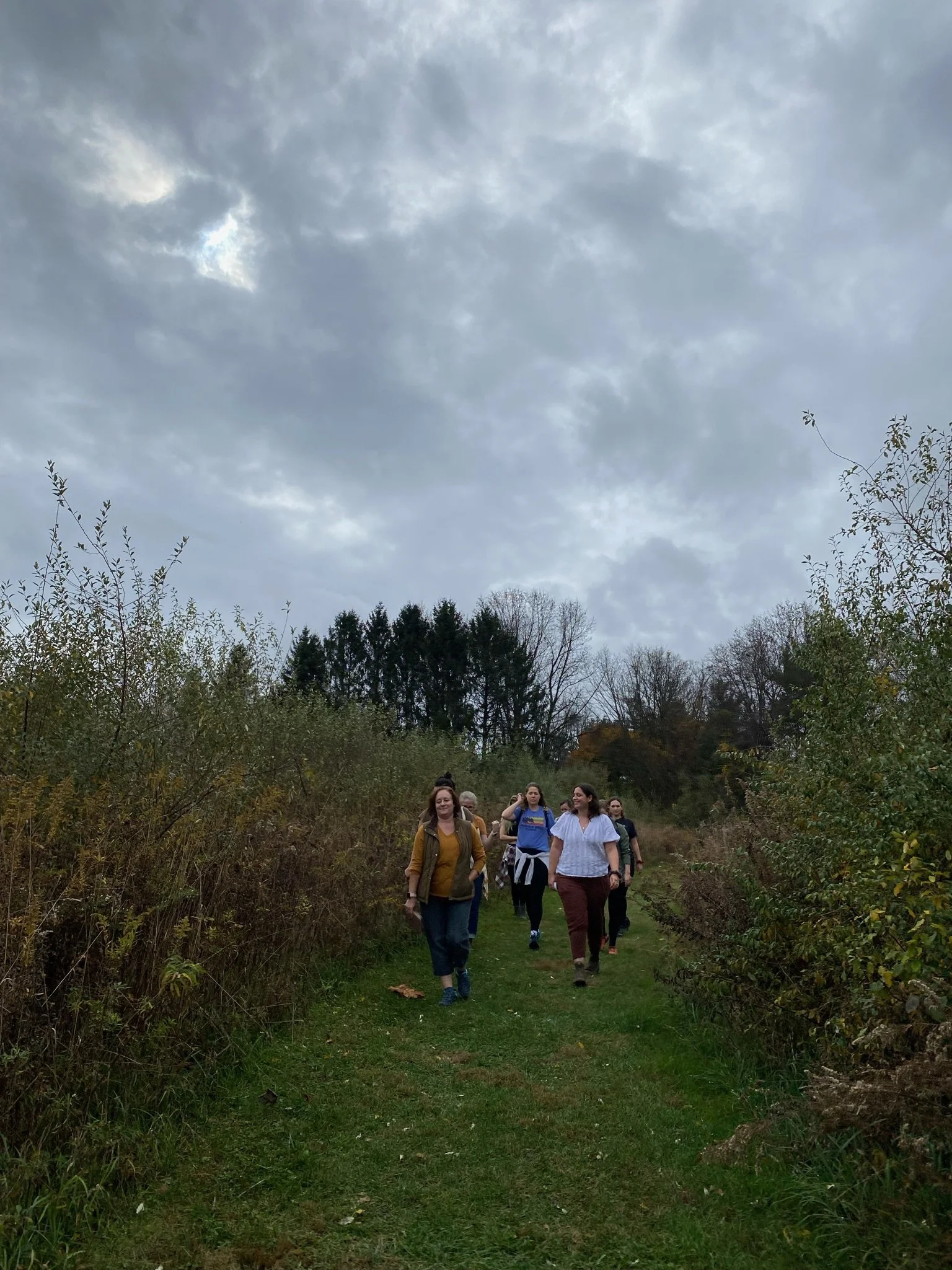
Cross Quarter Club gathered on Sunday, October 18th in celebration of autumn and Samhain/All Hallows. Unforntunately, our workshop had to be rescheduled at the last minute, but we enjoyed the pavilion for the afternoon, sharing good snacks and good conversation! Anya Peters of Hedgerow Photography also did mini sessions for anyone who wanted them. Enjoy this photo recap of the event!