
My Guide to Choosing the Perfect Paint Color
This blog post has been updated! Click here for the 2022 version.

This is something that I want to tell every customer that walks into the paint store. Especially the lady who painted each wall in her bedroom a different shade of bright orange and topped it all off with a royal blue accent wall... but to each their own!
Color is an extremely important part of interior design but too many people get pigeon-holed in thinking that if they want to have a color in their room, they have to paint that exact hue on every wall. In my opinion there are a lot of sophisticated and interesting ways to bring color into a room.
1. Pick an accent color, and then dial it back a few notches for your walls.
This is goes along with what Robin Bell was saying about choosing the slightly drab stepsister. I tell customers all the time, if you want todesign your kitchen around an awesome lime green vase, don't paint your kitchen the same shade of lime green! Against the same color wall, the lime green vase will just blend in and not be the statement making piece that you want it to be. But against a lighter shade of green, or even a greenish gray, the lime green vase will shine! Here are a couple rooms that get it right:

Lovely turquoise vases accent the beautiful dresser-turned-island in this kitchen and stand out against a lighter, washed out turquoise blue on the walls.

Rich amethyst was chosen for the fabrics in this bedroom, and against a grayed-down purple wall color, the hue stands out even more.
2. Create a neutral "shell" for your room, and then punch it up with fabrics and accessories.
This is especially beautiful if your room has a lot of architectural detailing, like crown moldings or wainscoting. Neutral colors, with enough contrast, highlight architectural details without detracting from them. From there, you can add color with draperies, pillows, throws, and accessories. This is great if you are wanting to use a bright color, like pink, orange or yellow. A little bit of these colors go a long way.

The subtle greige (gray-beige) walls of this living room are the perfect backdrop for blush pink accents.
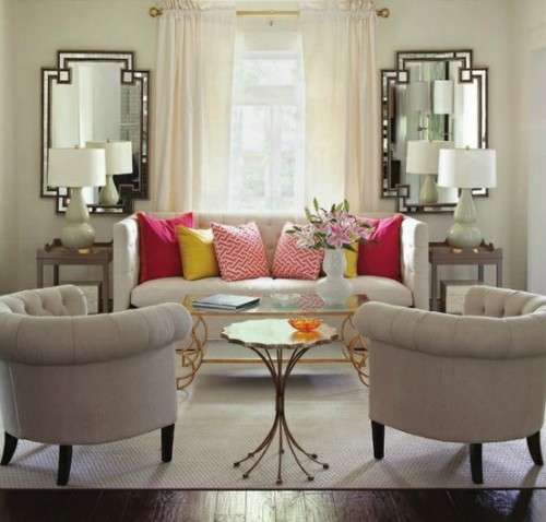
This room is all off-white, with the exception of some vibrant pink and yellow throw pillows.
3. Choose one wall as a focal point, and paint that wall your accent color.
This is great for people who love dark, vibrant colors that can sometime be overwhelming when painted on all four walls of a room. When choosing which wall should be your focal wall think about where your eye naturally goes when you enter a room and where you WANT you eye to go to when you enter a room. If you have a wall with an ugly air conditioning unit sticking out of it or something, that's probably not the wall you want to choose. On the other hand, if you have a beautiful fireplace or set of built-ins on one wall in your living room, that's a great place to paint an accent color. If your room is a bit non-descript as far as details go, another good option is to choose the wall that is directly across from you as you enter the room and create a focal point from there.

Vibrant pink would be a little overwhelming when painted on all four walls but between the accents on either side of the fireplace and the beautiful floral fabric on the draperies and ottoman, this room is a girly girl's dream that balanced color with soft white neutrals.

The charcoal grey of the fireplace wall perfectly highlights the white molding around the gas insert and makes the artful objects on the built in shelves pop!
Stevie