Sterling Project | Home Office & Foyer
In Friday's post, I showed how just a few tweaks can totally transform the design of a room. Today, I'm wrapping up the Sterling Project by sharing both the Home Office and the Foyer. In these spaces, some simple styling made all the difference!
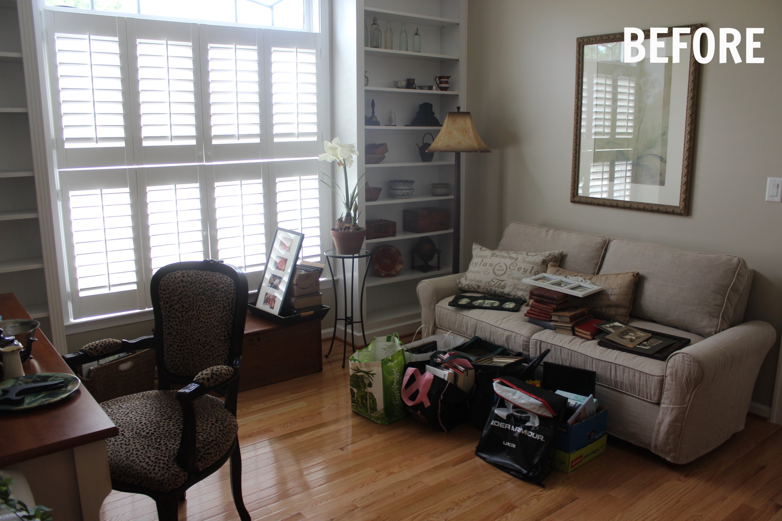
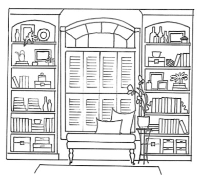
In this sunny home office, the clients already had just about everything they needed. I started by addressing the built-ins flanking the window. When I came for their in-home consultation, the shelves were looking a little bit unbalanced and cluttered. My first suggestion was to remove two shelves on each side for a cleaner look. The new taller shelf openings accommodate a larger variety of decorations and arrangements. Along with their Project Guide & Proposal, I sent this sketch of their built-ins along with some instructions on the best ways to style them using the items they already have.
My client did a phenomenal job! Her and I share a love for antique books and decor, which she styled beautifully along with old black and white family photos. With the wider shelf spacing, the decor has "breathing room" and by using vertical, horizontal, stacked and layered arrangements, the bookshelf styling has so much more depth and interest.


My client previously had this antique wooden chest under the window. I suggested pulling it out into the middle of the room to serve as a coffee table and layering a textural rug underneath to define the seating area. I pulled inspiration for the pillows from the painting above. I'm a huge fan of pattern mixing, and you can never go wrong mixing a floral with a geometric. This green and gray floral pattern has the same, vintage illustration look as the artwork in the Dining Room and Breakfast Nook. It's a small detail, but it helps to make the entire home design feel intentional and cohesive. My client already had this beautifully carved wooden floor lamp, I just recommended modernizing it by switching the gold, bell-shape lampshade to a simple, white drum shade. It completely changed the look of the lamp!


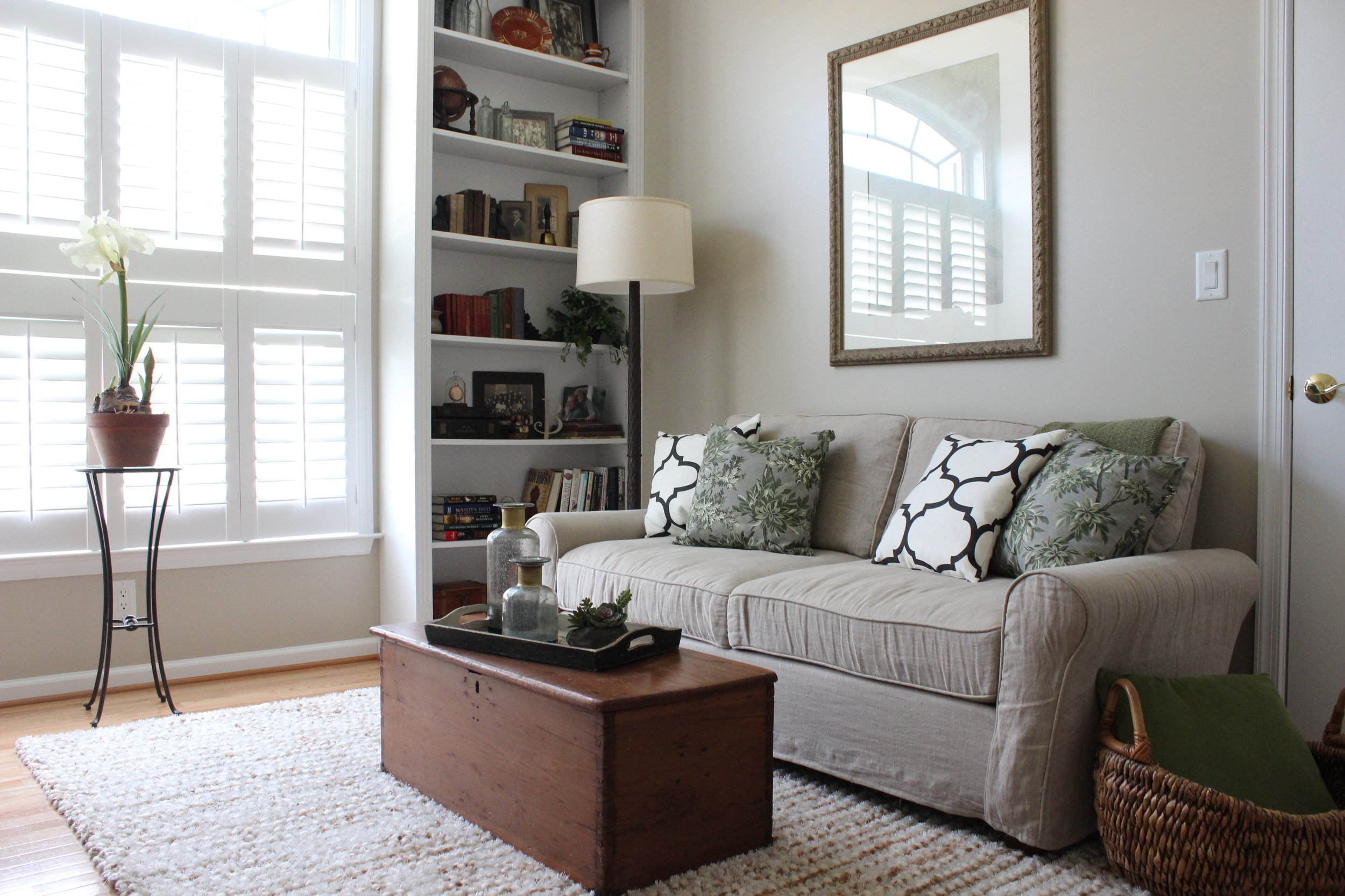

Sources: Geometric Pillow | Floral Pillow | Area Rug (similar) | Grey Glass & Gold Vases | Faux Succulent

The foyer was also a place where a few simple changes really impacted the feel of the space. We started by removing the oak grandfather clock that's just barely visible on the right hand side of this photo. It was a beautiful piece, but it just didn't fit the feel my clients wanted for their home anymore. I loved the scale and finish of their console table, so we kept that and decided to focus our efforts on restyling this space with new art, lighting and a large area rug.
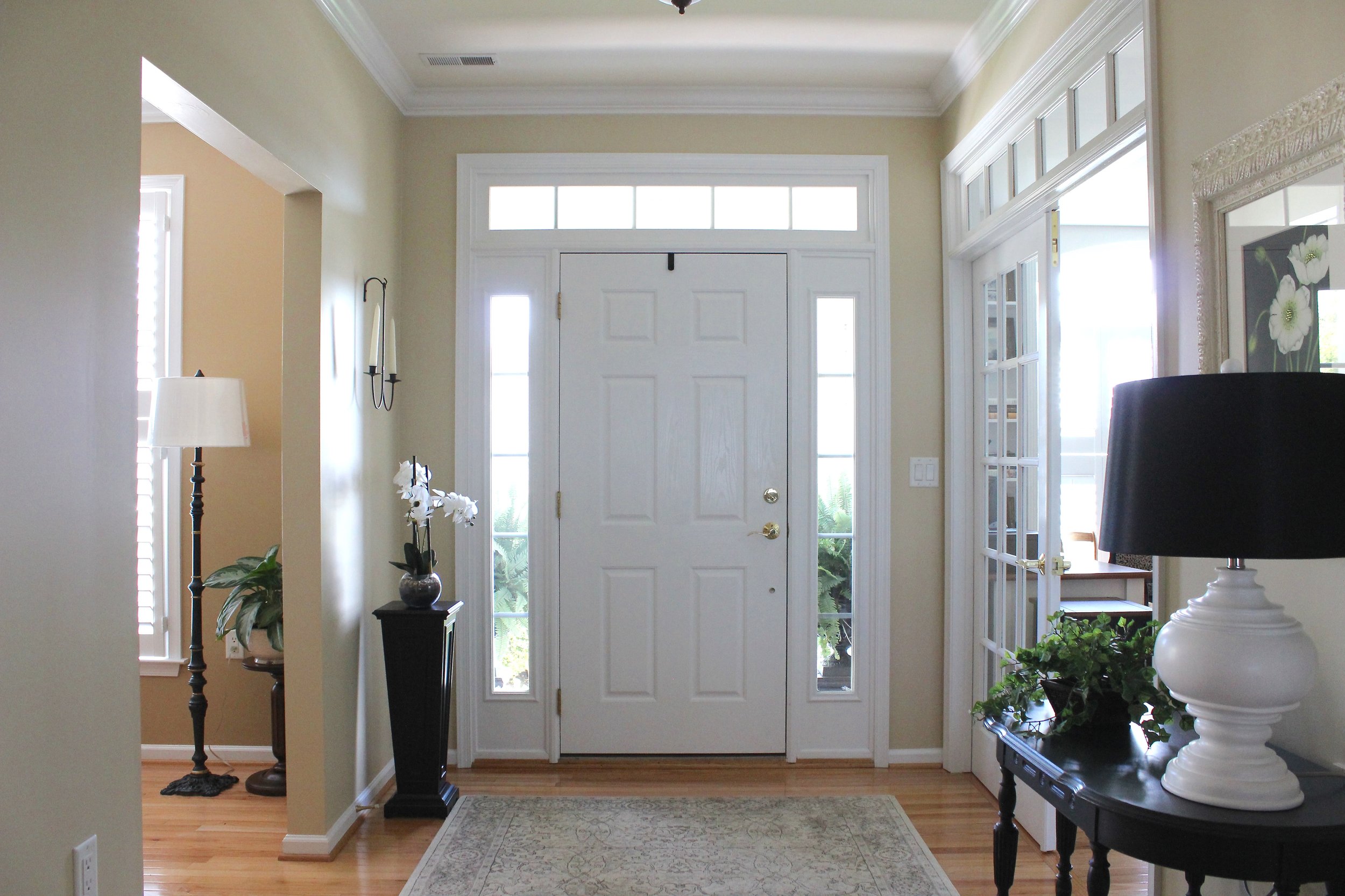
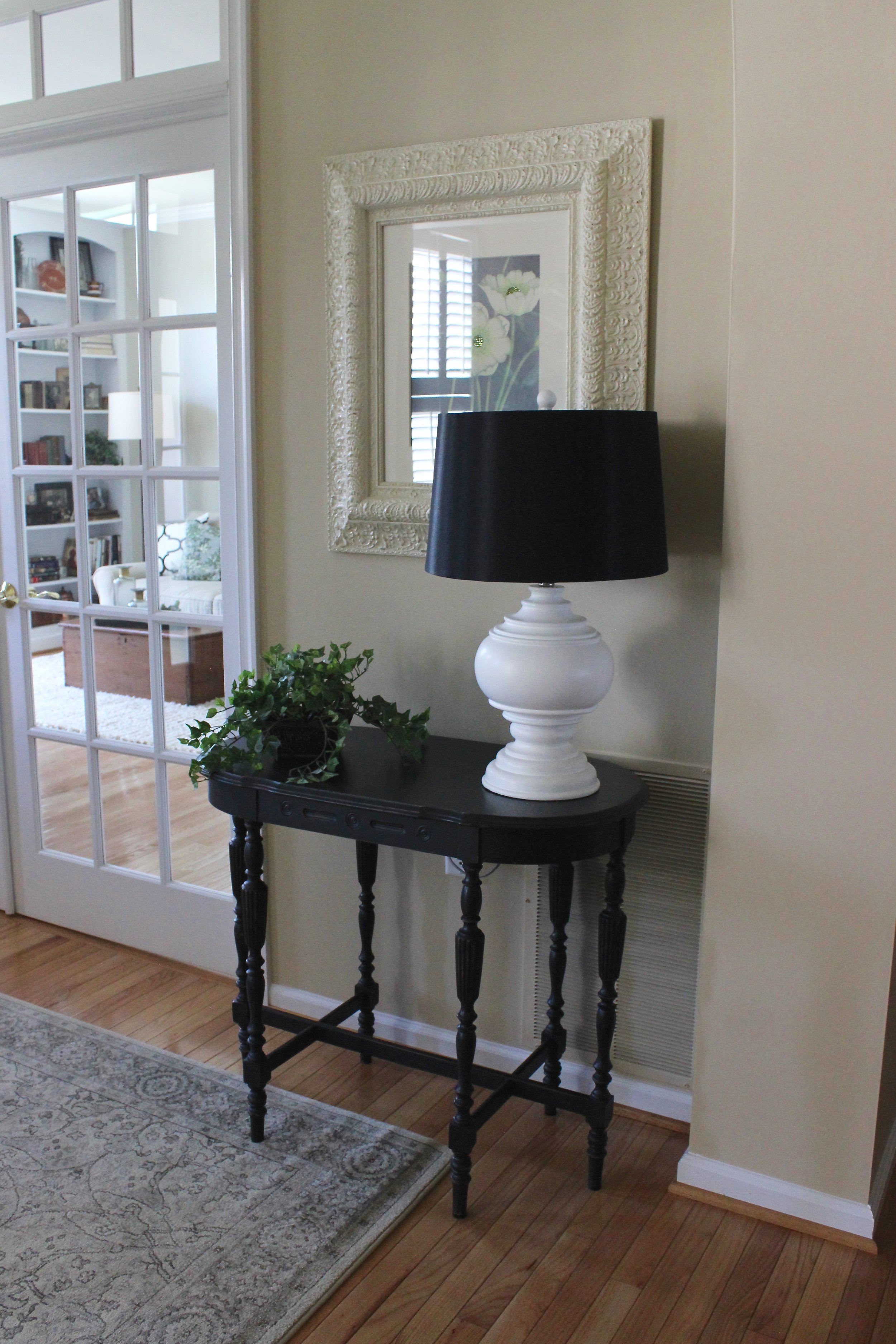
Sources: Artwork | Lamp | Area Rug (similar)
I had so much fun designing the Sterling Project! Even thought we focused on just 5 key vignettes (read more about the design process, here), their whole home feels fresh and new.
See More from the Sterling Project : Living Room | Dining Room | Breakfast Nook